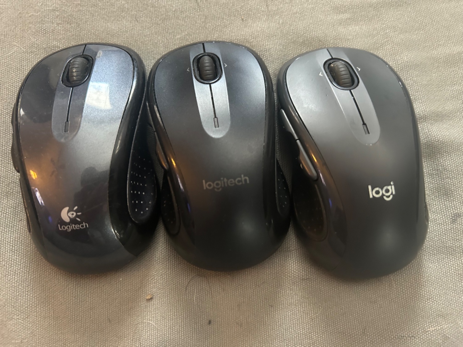
jeffw@lemmy.world to Mildly Interesting@lemmy.world · 6 months agoI lost my mouse a couple times and bought an exact replacement, then found the old one. You can see the evolution of the logolemmy.worldimagemessage-square119fedilinkarrow-up1738arrow-down117
arrow-up1721arrow-down1imageI lost my mouse a couple times and bought an exact replacement, then found the old one. You can see the evolution of the logolemmy.worldjeffw@lemmy.world to Mildly Interesting@lemmy.world · 6 months agomessage-square119fedilink
minus-squareSwordgeek@lemmy.calinkfedilinkarrow-up2arrow-down3·6 months agoAs far as I’m concerned, printing your name in a weird font doesn’t even qualify as a logo. The leftmost one is good - and the full-colour version of it was pretty cool, back in the day. The middle one is bland, except for the “g” which is dumb. The right one is stupid, and keeps the dumb g. Garbage. The graphic designers need to give their heads a shake.


As far as I’m concerned, printing your name in a weird font doesn’t even qualify as a logo.
The leftmost one is good - and the full-colour version of it was pretty cool, back in the day.
The middle one is bland, except for the “g” which is dumb.
The right one is stupid, and keeps the dumb g.
Garbage. The graphic designers need to give their heads a shake.